Starch Friends: Graphic Designers
08 May 2025
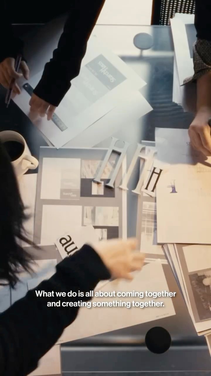
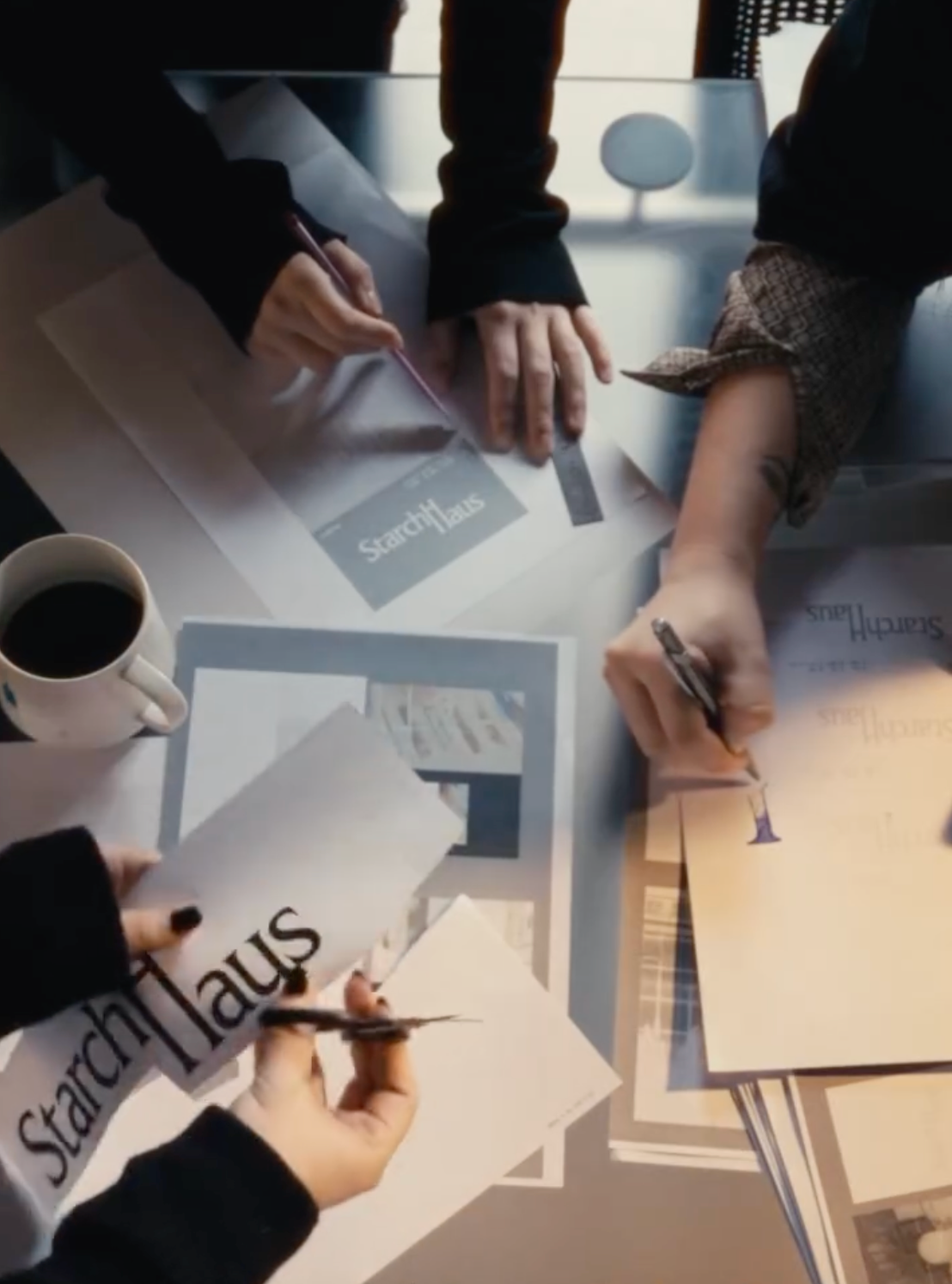
Friends who share a deep understanding of Starch Haus come together in the journey of visualizing the essence of the creative agency. Graphic designers Jin Lee and Hailin Park are both our long-time collaborators.
Perhaps more than mere collaborators, they are close personal friends of the agency, well-attuned to our taste and character. With Jin Lee envisioning the logo and Hailin Park creating the overall graphics, the soul of Starch Haus is brought to life.
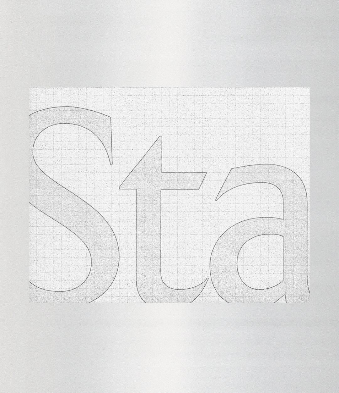
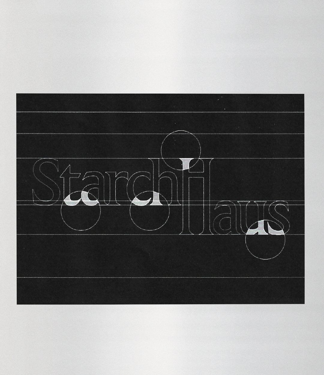
As a blank canvas brimming with endless possibilities, Starch Haus invites and nurtures the creativity of its collaborators. The logo adopts a monochromatic approach, stripped of all unnecessary elements, using only light intensity to express depth.
The letter ‘H’ with unusual proportions, consist of two vertical segments linked like a ladder. The parallel positioning of the two words -organic (starch) and solid (haus)- complete the branding through a seemingly impossible convergence.